
Custom fonts and the return of heritage in luxury brand logos
Typography has become part of the international conversation. Most people know their sans serifs from their serifs, free online software can make almost anyone feel like they are a typographer, comedians even make jokes about fonts. However, ease of access does not mean better results. As the tools to use fonts become more sophisticated and available to all, designers automatically seek different ways to use typography to communicate ideas in order to continue pushing the artform forward.
In branding several typographic trends are happening at once: the rise of custom fonts, the return to heritage and craft, and the use of animated (or kinetic) typography. Heritage and high tech side by side. Which of these trends are luxury brands adopting and why? This piece answers the questions we get asked most about luxury typography, from the best fonts for luxury brands, to custom fonts for luxury brand logos, and animated type.
First, a quick game: see if you can match nine luxury letterforms to their brands.
Can you match the letterform to the luxury brand?
Nine letters, nine luxury houses. Hit start and see how many you know.
You matched 0 of 9.
What are the best fonts for luxury brands?
There is no magic list. The best fonts for luxury brands tend to be bespoke. A custom typeface, used consistently, becomes synonymous with the brand, and nobody else can license it. Once considered an indulgence, now they are becoming more of a necessity. A custom typeface can not only increase brand recognition it can, in the long term, save money. Once you own your brand font outright there are no renewal costs or extensions for new properties as you grow. However, if custom feels beyond reach, there are thousands of fonts to choose from, and small modifications by an experienced typography designer can make all the difference. Choosing the right font for your brand is best made as part of a brand identity and design system, not in isolation.
“People ask me for ‘the best font’ like there’s a right and wrong answer. The ‘best’ font is the one that looks good in the designer’s hands and on the brand’s name. It must suit its language, and convey its values by association.”
Most typefaces in the right hands can be put to good use. There are good fonts and bad fonts, in much the same way there’s good music and bad music. The challenge for the designer is in choosing the right font for the right ‘mood’ or brand association. Every designer has their own way of interpreting what makes a good or bad typeface along with a (relatively short) list of dependable ones. The challenge for the Creative Director is to choose the right typography designer.
If bespoke is not an option then the old associations can still be effective. Serif, slab serif and cursive fonts read as luxury and classical. Sans-serif, mainly from the post-war modernist era onward, bring simplicity, authority and a contemporary twist. Bertold Akzidenz Grotesque, the classic Swiss modernist face, is still one of our favourites, and like Helvetica it has been copied and reworked endlessly. Helvetica remains one of the most dependable faces ever drawn. It’s also the only typeface to have a movie made about it.
What makes an elegant font combination for a luxury brand?
Traditionally, a good font combination paired a serif with a sans-serif. That habit goes back to how we all first took in information, through newsprint and magazines: bold, attention grabbing mastheads and headlines with well set body text in a complementary font. When brands do reach for elegant font combinations, the pairing works best with a clear job for each face rather than two competing for the same space.
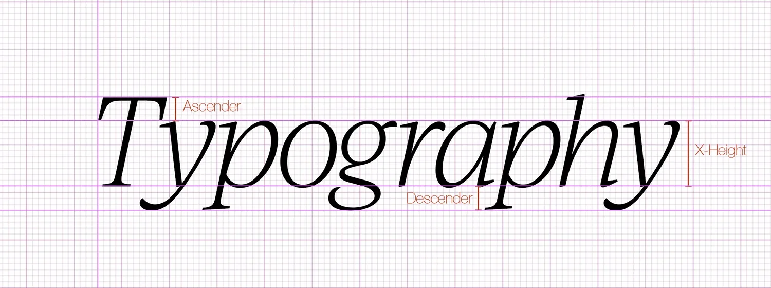
Choosing different fonts with similar characteristics can mean they work well together. Look at fonts with similar ‘x’ heights, descender and ascender heights. Check the weights, glyphs and ligatures each font offers and how they could be used to good effect. Finally, and most importantly, test test test.
You actually don’t need a combination at all. The single-font, monolithic route is getting more popular, and that’s where bespoke type comes into its own, because it lets a brand hold the licence and make the face distinctively its own. Typography can set a trend, but it is more often reflecting where we are as a society. Right now that reflection is an everything-everywhere-all-at-once mentality. You can try anything, see anything, use anything at any moment, so influences from every decade sit side by side. Old references get pulled through and given a new twist and when mixed with the latest technology, at its best it is genuinely groundbreaking.
What do successful brand identity redesigns tell us about modern logo fonts?
For most of the 2010s, luxury brands threw out the serif and brought in a flat, modern sans-serif. Burberry, Celine, Dior, Balenciaga, Balmain, Berluti: the wordmarks started to look interchangeable.
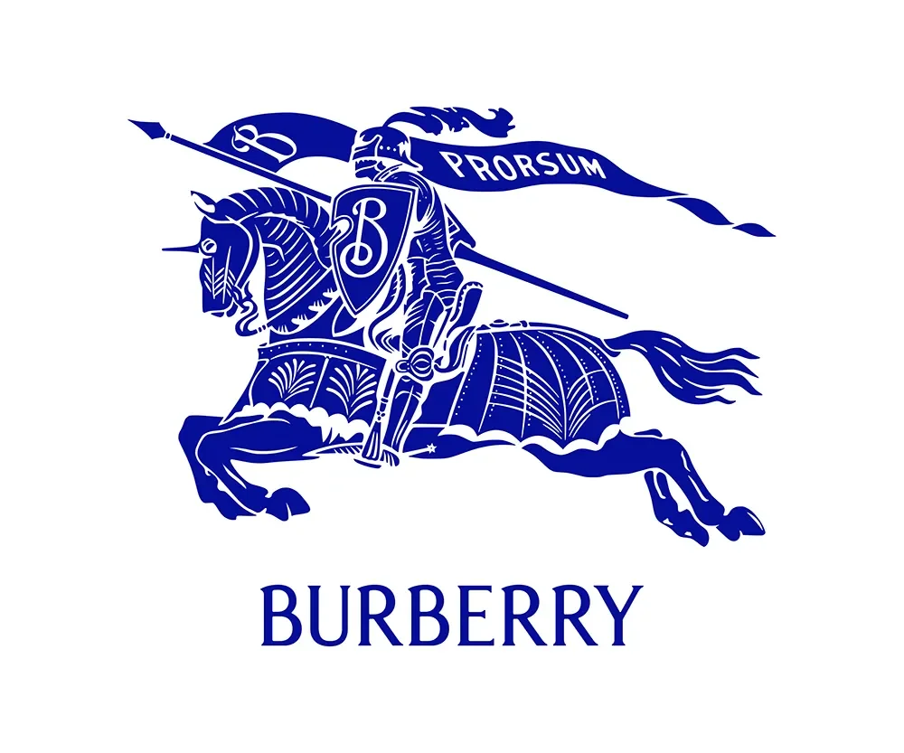
The reasoning was mobile. A heavy, simple wordmark reads more clearly on a small screen, and Dior said as much when it moved to an all-caps block logo in 2018. For a while, modern logo fonts all pointed the same way. But the result was visual uniformity. When Daniel Lee commissioned a new serif logotype for Burberry along with the 1901 equestrian knight in 2023, the reaction online was relief rather than outrage.
How are recent luxury brand logo trends influencing consumer perception and loyalty?
Google’s algorithm rewards expertise, experience, authority and trust (EEAT) and consistency feeds all four. Brands that stay consistent are more likely to earn loyalty. But loyalty is fragile, which is why a brand protects it with strong, consistent messaging and its own set of tools: guidelines for logo use, colour, typography and imagery, plus rules for proportion and placement, and a clear list of do’s and don’ts. Together they create a recognisable through-line that holds even when the campaigns change.
A brand’s EEAT can be knocked off course by all sorts of factors. A rebrand can take a year or more to hand over, and by the time it reaches the public, the company underneath has changed. Directors leave, priorities shift, and coherence can slip within 18 to 24 months. The brands that stay recognisable, and maintain their loyalty, are the ones who invest in the right people to keep the brand on track, with the instinct to know when to adapt without breaking the structure.
“Loyalty isn’t won by loud campaigns. It’s won by recognition and reliability. Iterative consistency is the strategy, not the epilogue.”
Are luxury brands using animated and kinetic typography to capture attention?
Whilst illustration and animation are clearly proving popular amongst luxury brands (Hermés, Lacoste, Loewe and Hugo Boss to name a few) many have been cautious to embrace animated typography. Chanel is among the few luxury brands using animated word marks to good effect on social and in-store displays.
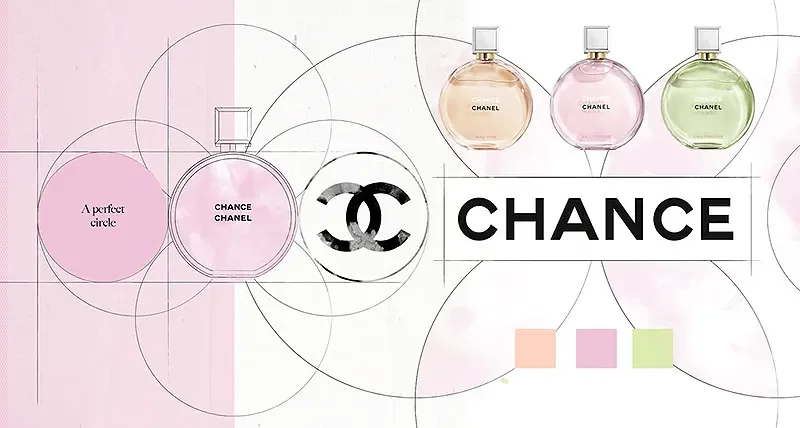
The origins of animated typography, or kinetic typography lie in 1960’s film title sequences, it has moved on considerably in recent years with the ease of accessibility to more powerful tools. Many household brands have adopted this trend to cope with the reduced attention span of consumers. It lands an idea fast; dropping in, jumping out, holding attention for a beat, it stops the scroll and reinforces brand messaging quickly.
However, push it too far and it could become too shouty. Restraint is key for most luxury brands and the current mood leans toward work that feels handmade rather than machine-made. Luxury brands need to tell their stories, these stories are mostly told through the imagery more than the words. Counterintuitively, this makes elegantly animated typography a standout opportunity for luxury brands.
“Animation buys you a second of attention, but what you do with that second matters more, for longer.”
When to move type, & when to leave it still
| Animate the type when... | Keep it still when... |
|---|---|
| It's a social post or short campaign that needs to stop the scroll. | It makes the copy hard to read. |
| It's an in-store or digital display, seen briefly. | You need to create tension and focus the reader. |
| Your website needs a makeover. | Movement would compete with the message rather than serve it. |
From modern back to heritage: four houses that changed course
| Brand | 2010s move (sans-serif) | 2020s move (heritage) |
|---|---|---|
| Burberry | 2018: Peter Saville replaced the equestrian knight with a heavy sans-serif wordmark. | 2023: Daniel Lee brought back a serif logotype and the 1901 knight motif. |
| Celine | 2018: Hedi Slimane removed the accent from Céline and spaced it into a plain sans-serif. | Re-integrated the historic 1970s Triomphe monogram as the anchor of its bestselling bags. |
| Dior | 2018: switched to a bold, all-caps block wordmark to read better on phones. | Revived its historical 1960s serif logo to restore couture heritage. |
| Loewe | 2014: replaced the classic Bembo serif with a bespoke logotype under Jonathan Anderson. | Handed the identity to artists (David Shrigley) for short, playful 'chapters'. |
“Step changes can persuade brands into believing they need to change. In the 2010’s, that change was mobile shopping. Now, in the 20’s, it’s AI. Brands should evolve as they grow, not ‘knee-jerk’ react to external factors.”
What are typography best practices for ensuring readability and accessibility on a website?
The single best practice is the least technical one: get the right designer. There’s no substitute for the right person on the right job. After that, readability and accessibility come down to restraint.
Online, give type a little more breathing room than you would in print. Wider kerning, spacing and leading, but not big ugly gaps. Let the space bring attention to what you’re saying, and don’t crowd things. If you use animation, be selective, keeping someone reading is the real goal, and the content has to be good to begin with. Sub-edit hard, because on a narrow mobile column a long or hyphenated word is a nightmare to set well.
The detail and hand drawn work still sits mostly outside a non-designer’s reach. Even tools with optical letter-spacing don’t handle every character well, and numbers in particular can space badly. That’s not a criticism of the software so much as a reason a professional eye still matters.
How do you avoid common typography design mistakes in web design?
Know when to stop. A quieter, more confident layout gets heard above the noise. Then test properly. Feel how it reads for a real person, on every device, and keep the eye flowing down the page rather than doubling back up.
| Common mistake | The fix |
|---|---|
| Overcrowding text to fit more in. | Give it more room on screen than you would in print. Wider spacing, wider leading. |
| Long and hyphenated words on narrow mobile columns. | Sub-edit hard. Cut anything the reader doesn't need. |
| Shouting loudly when a whisper will work better. | A quieter, more confident layout tends to get read above the noise. |
| Low contrast, poor spacing, no clear hierarchy. | The design-school basics still matter. Test how it reads on every device. |
Own a distinctive typeface and stay consistent with it. Move the type when it helps land an idea on screen, keep it still when someone needs to read. Be careful of making ‘knee-jerk’ reactions when looking at a brand re-design, consider the long term and invest wisely in the right people and tools for the job.
Take the next step: shape your brand
Affluent Audiences is a marketing agency for luxury brands. To start your branding project, get in touch using the form below.

References
[1] Dezeen, “Burberry unveils archive-inspired charging knight logo,” 7 Feb 2023. https://www.dezeen.com/2023/02/07/burberry-daniel-lee-logo-equestrian-knight-design/
[2] LBBonline, “Is Burberry's New Identity the End of the ‘Serif Wars’?” 9 Feb 2023. https://lbbonline.com/news/is-burberrys-new-identity-the-end-of-the-serif-wars
[3] Dezeen, “Celine drops accent from logo,” 4 Sep 2018. https://www.dezeen.com/2018/09/04/celine-drops-accent-hedi-slimane-logo-design/
[4] Business of Fashion, “Olding: Luxury Fashion Branding,” (Celine Triomphe / heritage revival). https://www.businessoffashion.com/articles/luxury/olding-luxury-fashion-branding-valentino-gucci-givenchy/
[5] MyCompanero, “The Grand Return of Old Logos in Luxury Fashion” (Dior 1960s serif revival). https://www.mycompanero.com/en/blogs/blog-mycompanero/the-grand-return-of-old-logos-in-luxury-fashion
[6] Ultratype, “Chanel Kinetic Typography.” https://www.ultratype.tv/chanel-kinetic-typography
[7] The Conversation, “Flashy isn't always fabulous: why luxury brands should reconsider displaying their logos too prominently.” https://theconversation.com/flashy-isnt-always-fabulous-why-luxury-brands-should-reconsider-displaying-their-logos-too-prominently-220815
[8] Wordtracker, UK keyword volumes for typography terms, retrieved 22 Jun 2026.
