
MCBD
Brand Design for Institutional Authority

Brand design and visual architecture for the launch of the UK’s premier independent agency, MCBD.
Challenge
How do you signal immediate institutional authority for a startup agency entering a market of established giants?
Insight
The formidable advertising agency, MCBD, famous for their integrated work with Waitrose, approached Scott Parker for their brand design. They wanted a look that was fresh and culturally aligned with his credibility in the music industry, rather than looking like ‘just another boring ad agency’. Paul Briginshaw felt most agencies at the time were stuffy; he aligned with Scott on a simple, unfussy approach.


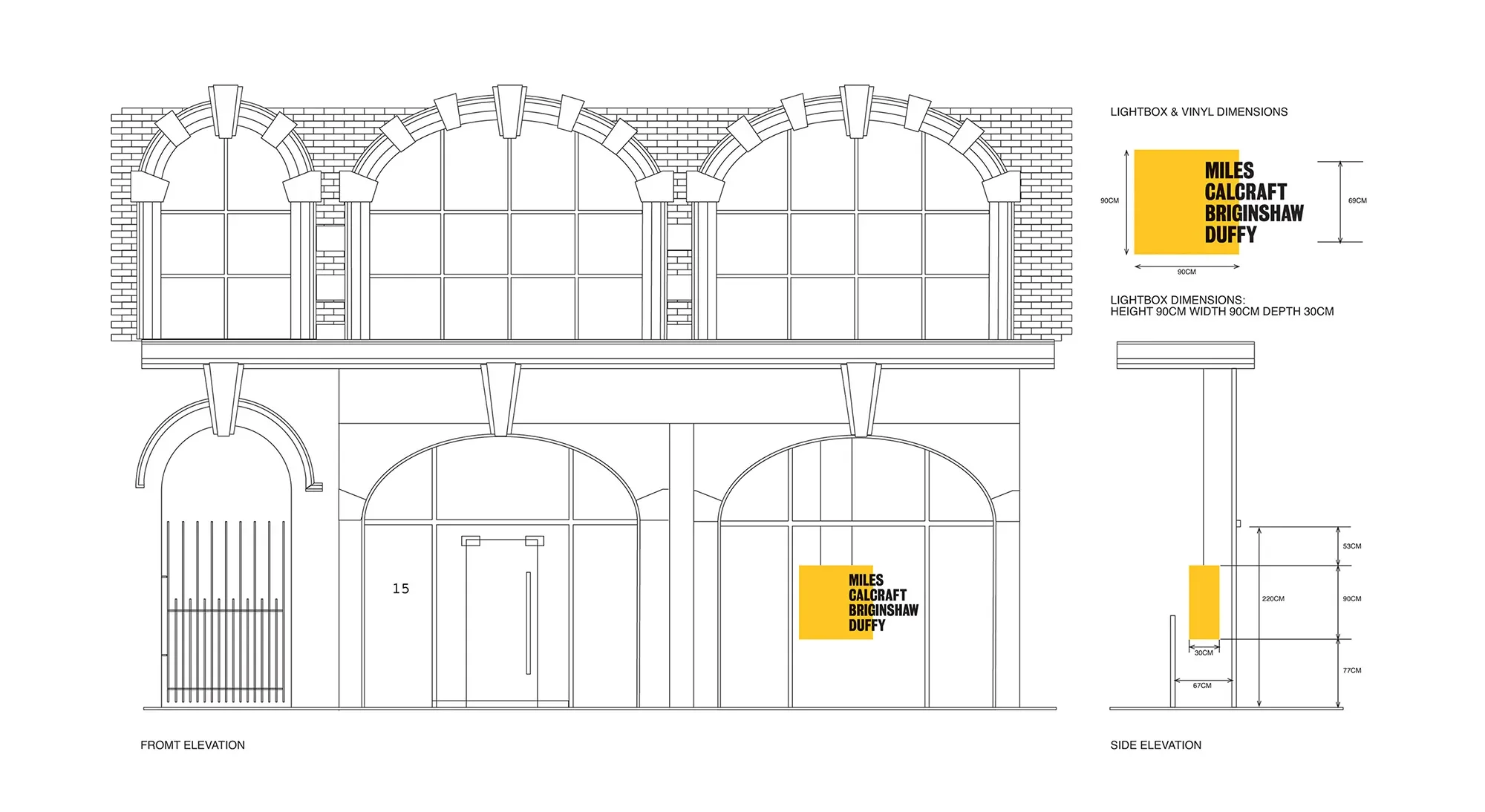
Transformed a 2D logo into an architectural landmark on Great Titchfield Street.
3D presence
Lessons from designing the MCBD brand identity on Great Titchfield Street
Stacked architecture that defined the agency through its golden era.
Brand DNA
Proving a reductive design approach could command attention in a crowded Fitzrovia market
High-Impact
How a simple design created a bold presence on Great Titchfield Street.
After being shown around the original Fitzrovia office, Scott proposed the concept of ‘thinking outside the box.’ The four names were offset over a striking yellow square in the colloquial order. Using a clean, sans-serif font allowed for perspective license; on the shop’s large window front, the names were displayed on the glass while a yellow cube sat behind it, adding physical depth. Given the agency’s prestige, this was a small job with a massive cultural impact.
MCBD brand design — Great Titchfield Street window installation
Brand:
Miles Calcraft Briginshaw Duffy (MCBD)
Tony Miles
Helen Calcraft
Paul Briginshaw
Robert Duffy
Industry:
Advertising
Skills:
Corporate Identity
Logo Design
Signage
Graphic Design
Led by:
Scott Parker
-
-
Probably. Category fatigue is boring. The fastest way out is pattern interruption: borrowing aesthetic codes from an adjacent world, while retaining recognition for what you do. That’s how MCBD stood out in Fitzrovia. If your sector feels samey, let’s have a conversation.
-
Because modern affluent audiences are values-led, more than status-led. Cultural fluency from music, media and design beats category-trained sameness. Our work with companies like MCBD, Bentley, Jasper Conran and La Prairie proves it. If you want resonance, not repetition, let’s talk.
-
Our principles. Deconstructed clarity, unfussy craft and cultural intelligence outlast trend cycles, which is why MCBD’s stacked mark defined an entire decade. If you want brand design built to endure, let’s see what fits.