
Luxury Lingerie
Visual Identity Strategy

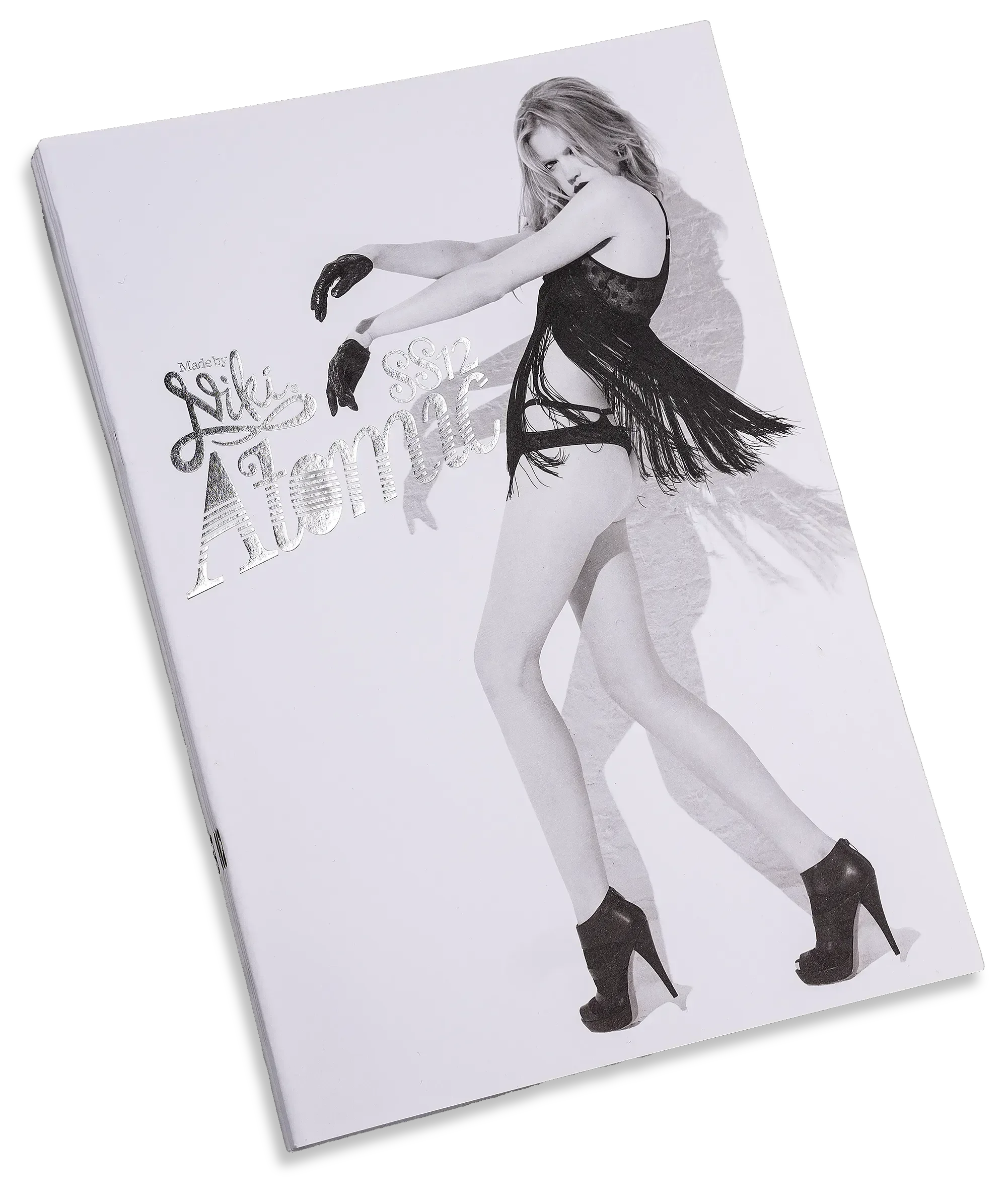
Visual identity and creative direction for the ‘Atomic’ luxury lingerie universe.
Challenge
How do you create a fashion campaign that opens doors to premium global retailers?
Insight
Luxury retail is more than a product sale; it is an emotional experience driven by shared values and belonging. The Atomic collection, inspired by celestial bodies, needed more than a photoshoot. Niki and Scott built a complete visual identity system. The naming conventions, typographic system, print design, sales materials and visual merchandising all needed to transmit the collection’s universe into a brand story with gravitational pull.
Collection:
Atomic / Made by Niki
Industry:
Fashion / Lingerie / Luxury Goods
Skills:
Visual Identity
Creative Direction
Art Direction
Graphic Design
Visual Merchandising
PR
Digital Marketing
Led by:
Niki McMorrough
Scott Parker
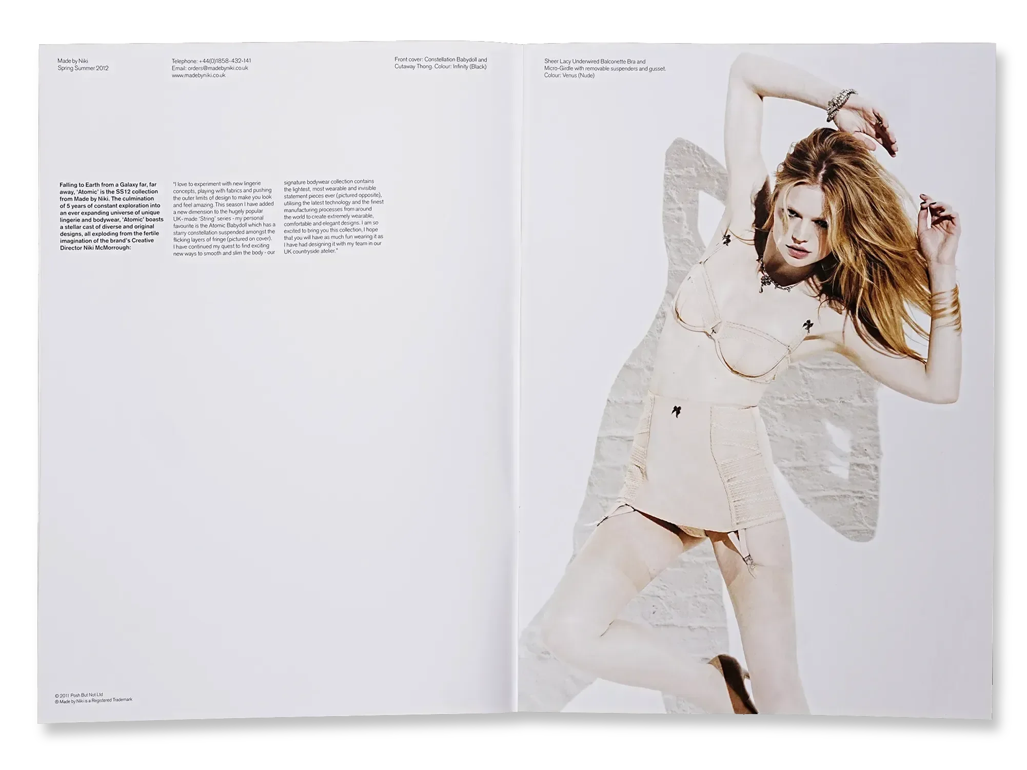
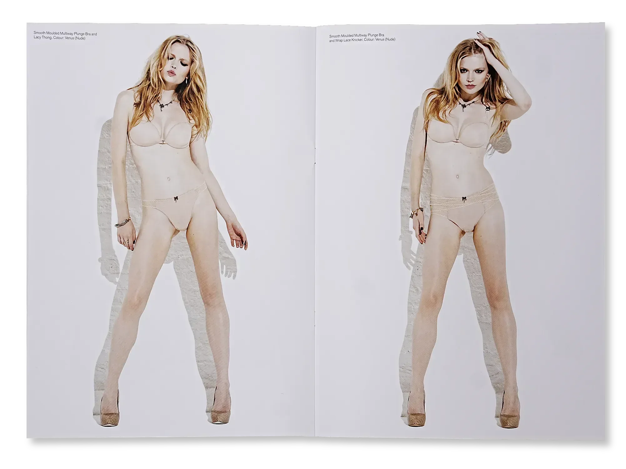
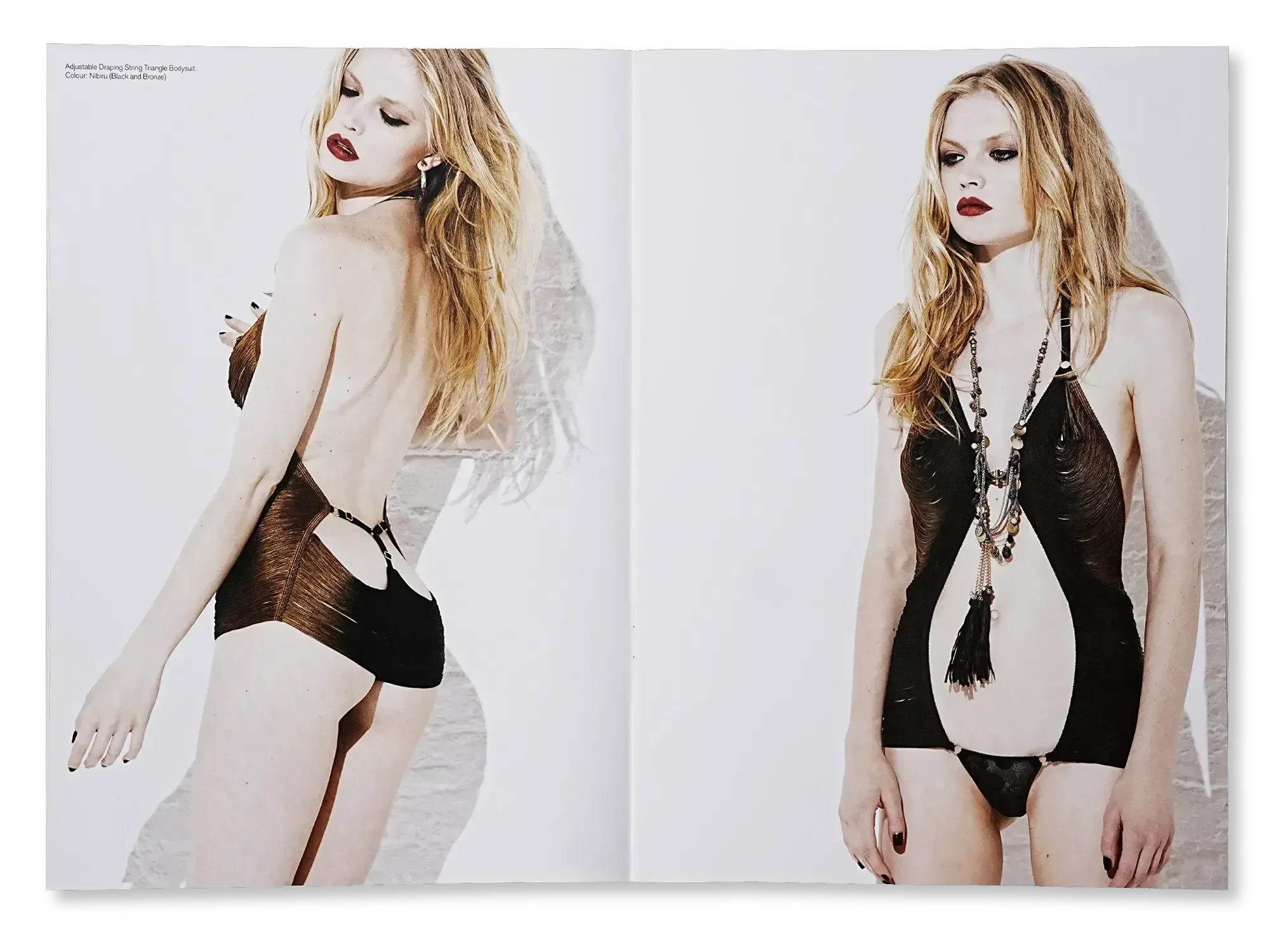
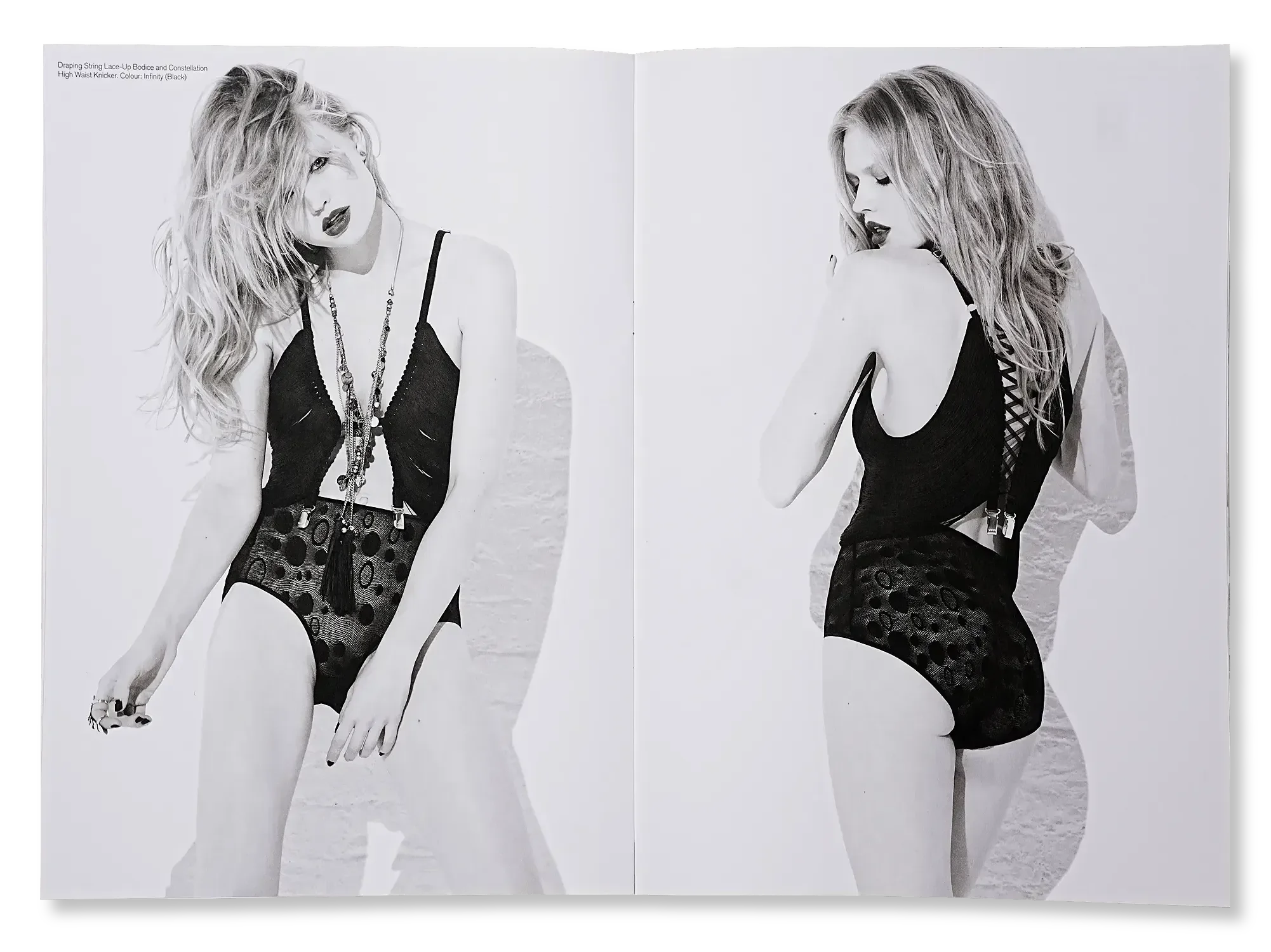
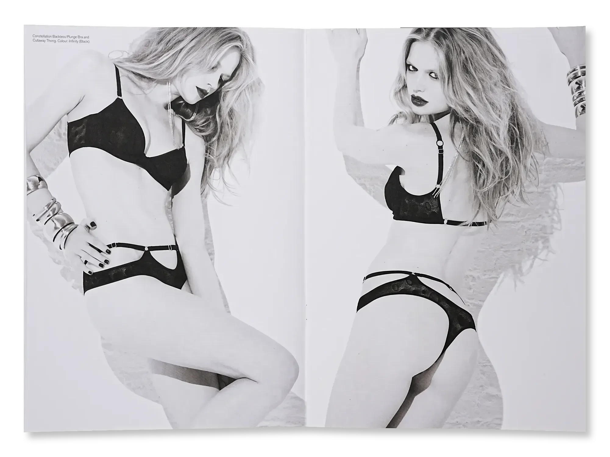
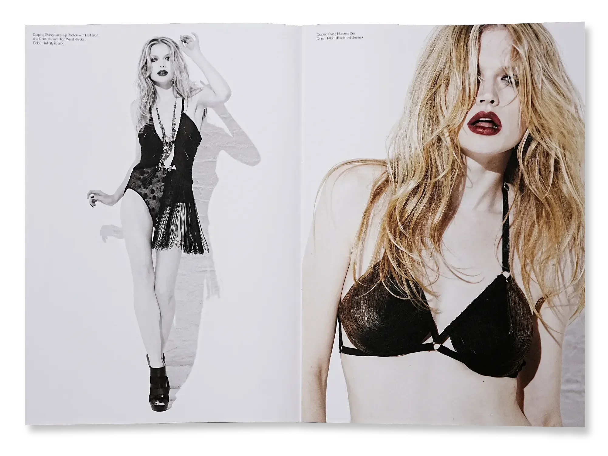
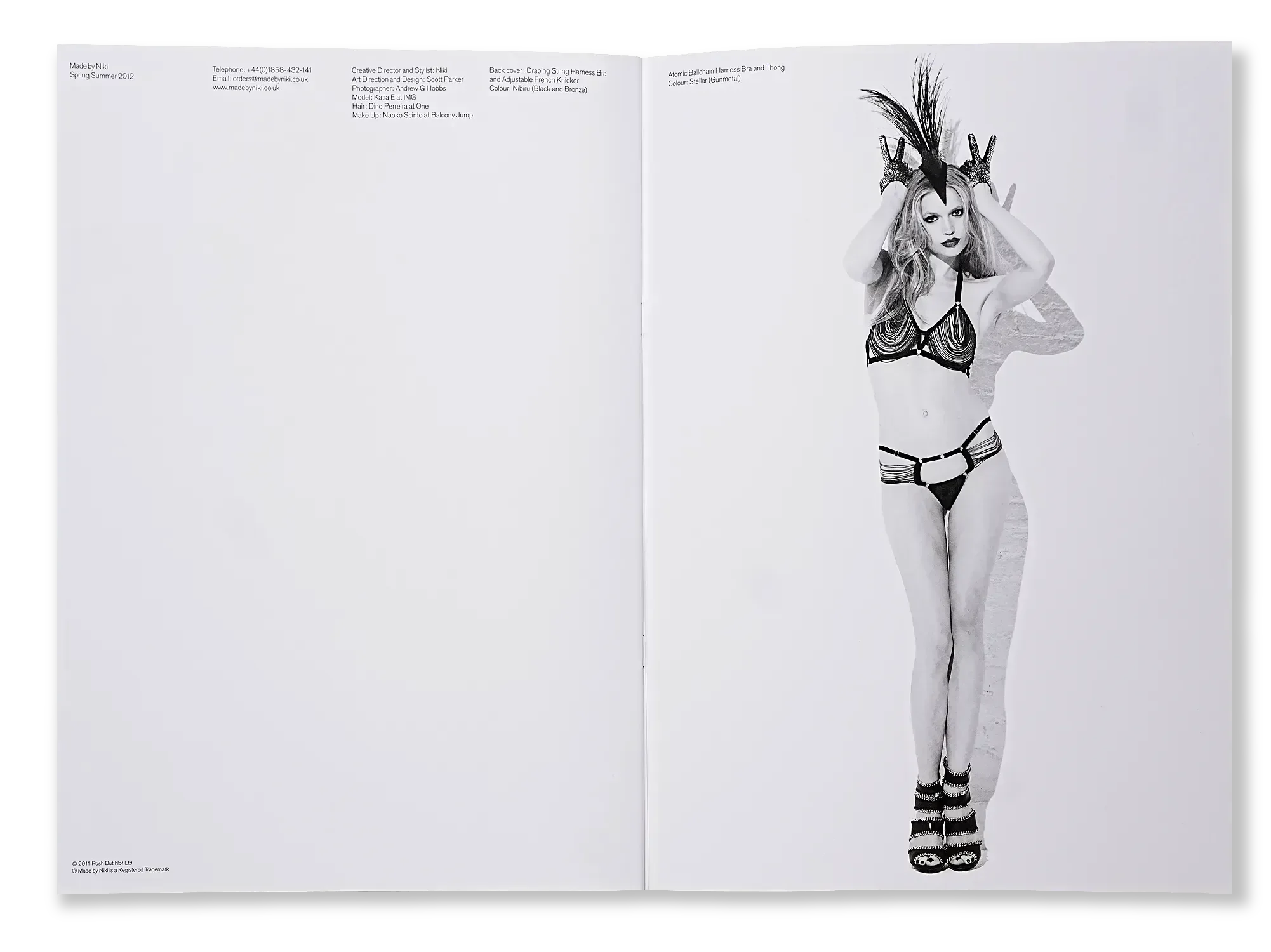
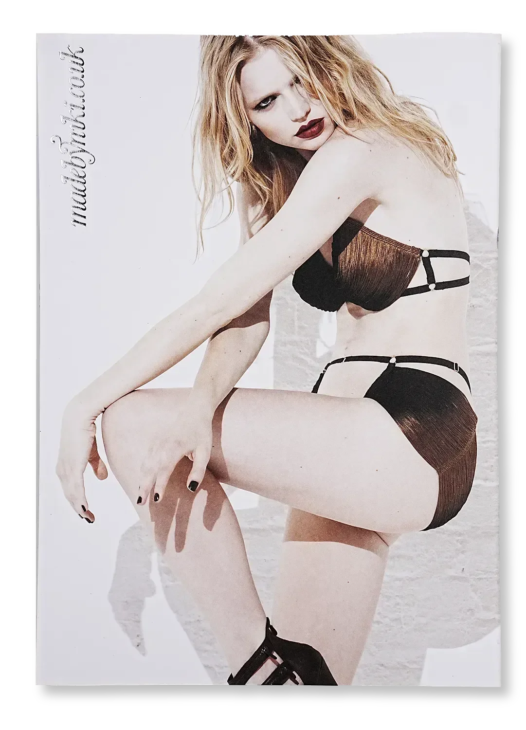
Including Selfridges & Isetan Shinjuku
+100 Stores
Headline results from the Atomic visual identity and creative direction campaign
Lovecat, Gloss, Esquire & ES magazine
Coverage
With combined reach of 2.5 million
Influencers
Editorial shoot with Valerie van der Graaf
Ellen von Unwerth
Identity
The collection got its own ‘Atomic’ logo featuring sweeping lines reminiscent of the brand’s signature string elements.

How did visual identity carry a founder-designed collection into global luxury retail?
We built the Atomic universe from the inside out. The product naming – Nibiru, Infinity, Mercury, Venus, Supernova – established the celestial system. The collection logo threaded the brand’s signature String motifs through its letterforms, carrying the garment design language into the graphic identity. ‘Supernova’ drove the high contrast lighting brief - explosive energy against white brick. The result was a complete retail asset suite that secured placement in Selfridges and Isetan Shinjuku.
In the press
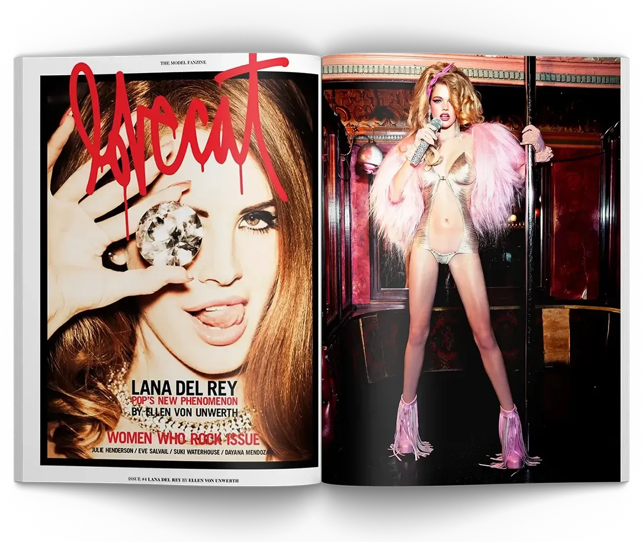
‘Atomic’ was editorially endorsed with features in Esquire, ES Magazine, Gloss and Prestige. Our favourite photo story by Ellen von Unwerth, with Valerie van der Graaf for Lovecat is pictured here.
In stores
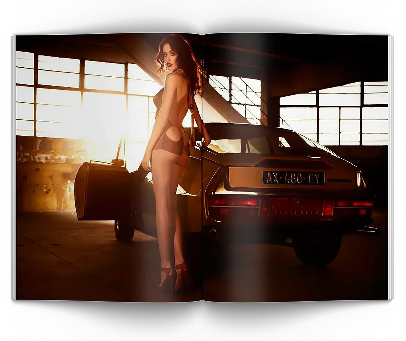
We placed ‘Atomic’ in ~100 stores in the world’s wealthiest cities, including Selfridges in London, Isetan in Tokyo, and Journelle in New York. Collaborating with the right stores is essential for alignment of vision in extended regional retailer editorial (pictured).






Influencers & UGC
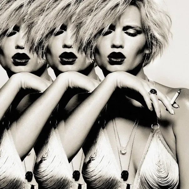
Influencer-customers such as Elle Liberachi, Elle May Leckenby and Ella Dvornik were drawn into the brand’s orbit, extending its organic horizon to over 2.5 million affluent fashionistas.


Ignition sequence
Once the collection saw first light, we ignited consumer resonance with digital content, atomised for SEO, web, email and social media. And then went supernova with google shopping, paid social and Adroll retargeting.
-
-
Usually with the audience, before the assets. Before we touch a logo we look at who actually buys in your category, what they already own, and why. The visual identity then translates that into something buyers recognise as retail-ready. If you’re stuck on this, let’s talk it through.
-
A logo is one asset. A lookbook is one campaign. Visual identity is the system underneath both — naming, typography, art direction, point of sale, all speaking the same language. It’s what makes a brand feel inevitable rather than assembled. Let’s discuss what yours could be.
-
In-house teams know the brand best, but can lose perspective on how it reads to a buyer who sees twenty brands a day. Niki and Scott bring an outside eye plus three decades inside premium and luxury houses. If your team needs a fresh angle, let’s talk.